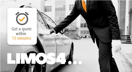


We evolved our brand identity to enter a new era.
Today, we at Limos4 are proud and excited to uncover our new appearance.
Here’s why we have decided to refresh our look.
The idea behind rebranding is to create a forward-looking brand identity that reflects our industry position and offering to the market.
As companies like Limos4 face new challenges, we have had to adapt our aims and goals to fit the environment we are operating in. The transformation will help us better embrace the changes and make a stronger personality that is more relevant to the society that we live in.
The new logo
Firstly, the new logo. It has been developed through a long collaborative process. The logo’s new shape and extended width embody the company’s ethos, which has always been built on trust, credibility and industry knowledge. The 3 dots, also a part of the logo, represent each city we currently serve and will serve in the future. In addition, the dots symbolize the period after the coronavirus took over the world, depicting Limos4 as a great pandemic survivor, continuing its new-normal operations regularly during and post lockdown.
Secondly, the reconfigured website. It features an engaging and unconventional design, illustrating the company’s passion for one-of-a-kind technological solutions in the industry. The new website showcases our authenticity, our service with character and our expertise, with more technical details and behind-the-scenes resources included. With the user experience in mind, we have built the site to enable our clientele navigate it with maximum efficiency and minimum time spent. Once they land on the website, each of the target industry representatives can reach the relevant page in seconds.

Lastly, our tagline. Although the old version still applies, it didn’t reflect enough on our global future. The tagline ‘‘Worldwide chauffeured service’’ replaces ‘‘Premium limousine service’’ to expand Limos4’s service scope and accentuate the value of a chauffeur rather than a limousine.
The color palette has remained the same, using either white or black to emphasize a page and its user’s needs. The aesthetically-pleasing-to-the-eye Golden Ratio applied to our design represents a seamless and straightforward journey, highlighting harmony and guaranteed quality in every Limos4 touchpoint. The raster filters and effects leave a lasting impression, conveying the message of unforgettable experience.
For Limos4, our services are much more than getting you from A to B. That’s why we’ve decided to lead the wave of change in our industry. We hope you’ll enjoy our new style. We are still Limos4. It’s just our new way of introducing ourselves.
Your Limos4 team 🤍
